Tiny Tower Game: Getting Constant Waves of Tenants Strategy


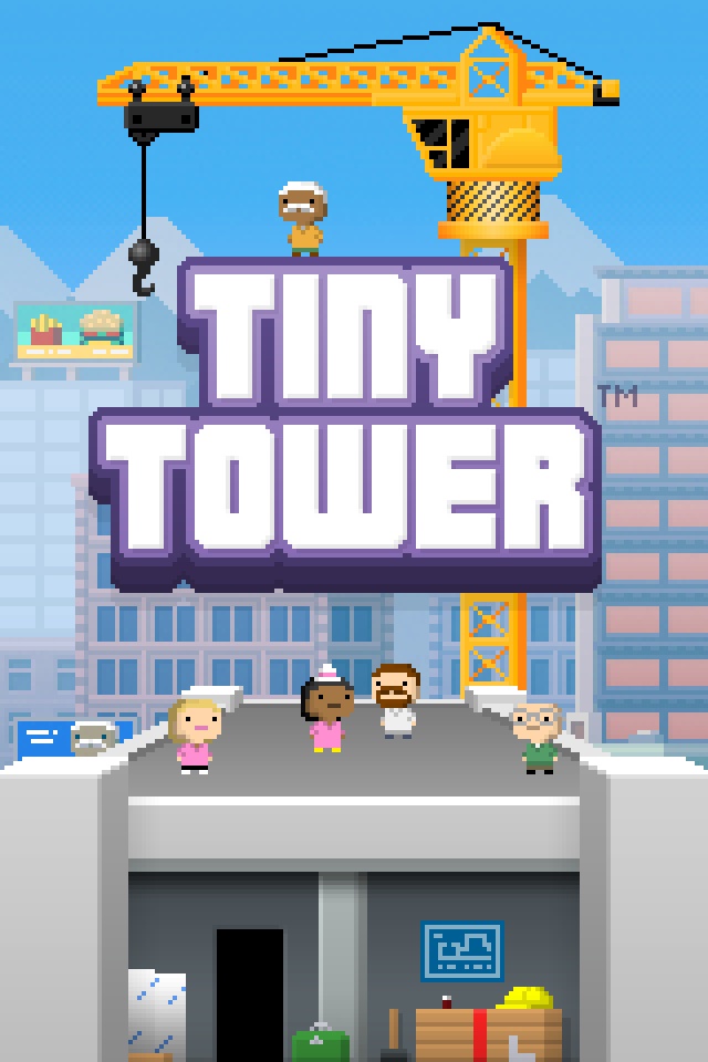
So I’ve recently stumbled across a game called Tiny Tower. I’m a programmer, an economist, and in the gaming industry. It’s game had my name ALL OVER IT.

A lot of people have stated that you should have your apartments 4/5 occupied to encourage more tenants to go to that floor. I found this to be a fallacy. I’ve rebuilt my tower 3 times now, and it’s safe to say, that I’ve discovered my most enjoyable mode of play. I like to have my stores stocked with nothing but people who DREAM of working for that store.

My Method

Keep apartments with vacancy count = occupied apartments + business floor count

My belief is that there IS NO floor optimization logic, the floor that a visitor requests is a simple dice roll. If you keep your have-vacancy floors = to occupied floors, then you’re guaranteed a 50% chance of visitors being a new tenant. I have 9 floors, 1 lobby, 4 with vacancy apartments, and 4 businesses, this strategy seems to be working so far, feel free to try it out for yourselves.

Have fun gamers!

Facebook Timeline Gets Negative Feedback

Don’t take my word for it, check out the all the requests on Facebook for aid in restoring their OLD Facebook profile.

http://www.facebook.com/help/community/question/?id=1856057

The list is MIGHTY long and is only saved by how users keep starting new threads on the Facebook community help forums. Below is a screenshot of a single thread complaining about the new “feature”. I don’t know where Facebook gets the idea that their users LOVE this feature, but for all those who’ve accidentally opted in, they’re desperately trying to opt OUT.

Perhaps this is what all the other social networks have been waiting for, the one dangerous fatal mistake that can cause Facebook to fall off the top.

If you haven’t activated Timeline yet, I don’t recommend it. If Facebook decides to make this permanent, I WILL switch to a different social network, probably Google plus.


Re-purposing of the Internet

Once upon a time, there were web pages where people went to find out things about a company. Thanks to web portals that aggregate this information, such as yelp. These web pages’ purpose is no longer the same.

You used to go to a restaurants webpage to get information on when the restaurant open, directions on how to get there, form an option of the restaurant and menu, but that was then. Now and days, we just use Yelp.com to check out the hours, review, and address. Then we use another aggregation site such as Google maps for directions.

The remaining question is “What do we now use a restaurant’s homepage for?”. For now, until we get an aggregate website for restaurant nutritional information, it’ll probably serve that purpose. In addition to presenting a single location to land on for discounts, company information, history, and etc. Until those subjects get aggregated too. Once everything is aggregated, the web site will more or less become a portal that directs the user to the information they’re seeking to an off-site location.

Dual Language Channel Videos

So recently, I started watching video files that had one language on the left, and a different language on the right speaker. Often times, people would simply turn off their left speaker, or right speaker, and watch the video with only one speaker. Unless you’re a big fan of, one-sided sound, this is simply not an option for me.

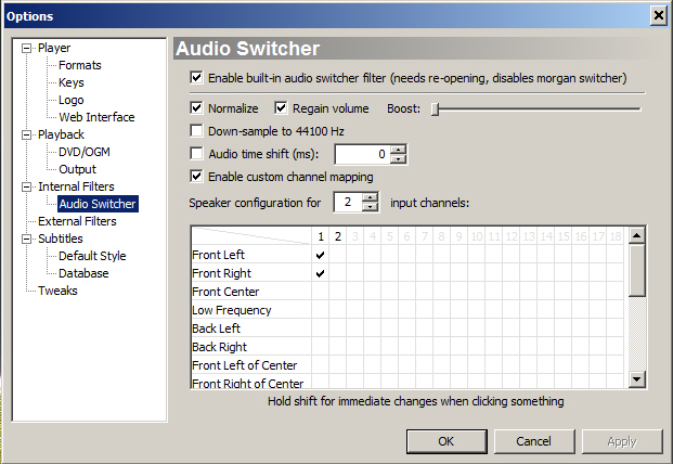
There is a way to alter the playback so that all the left audio of the video file goes to both speakers. I use media player classic, there are probably other ways to get to the following screen, but the concept is the same.

View > Options > Audio Switcher:


You click on view, click on options, and then select audio switcher. You’ll probably see Front left checked with 1, and Front Right checked with 2. If you check the boxes just like above, you’ll discover that all the left audio of the video goes to your speaker. Obviously, if you alter it so that 2 is checked instead, you’ll get the vice-versa.

I hope enhances your video watching experience, certainly did mine.

WordPress++

Mmm… My blog’s most recent upgrade came with an unexpected surprise. Most of the time, I don’t expect any type of cosmetic or functional changes with my blog upgrades. Why would I? Everything seems to work fine. I upgrade to keep the security exploits/vulnerabilities of wordpress to a minimal.

Anyways, I’m pleasantly surprised by the navigation bar that appears when you visit your site, and when you’re logged in. There are a few workflow improvements implemented in the navigation bar. For example, I can just directly to “Add New Post” from visiting my blog while logged in. Some might wonder why is this significant, but it’s definitely significant. No longer will I have to rely on a tiny box on the right hand-side and notice tiny changes to it to know whether or not I’m logged in. I’ll have a giant bar at the top to remind me to log out.

If I feel inspired while logged in, I can jump from the homepage right into article writing. It’s not necessary, but it’s a welcomed change. Good job WordPress team, I didn’t have to download the navigation bar plug-in after all 😉

etc/hosts.allow files and IP ranges

I’ve inherited a pre-configured box and recently had to audit the etc/hosts.allow files.

For those who don’t know what etc/hosts.allow files are. These are files that services such as vsftp, sshd, and etc, would go to check, to see if certain IPs were allowed or not. If the IP passes the allow rules, then it’s allowed to use the service, otherwise, usage of this service will be DENIED.

Anyways, I’ve found a lot of x.x.x.x/xx rules, and I know their intention. They wanted to allow a range of IPs, in this specific case, they wanted to allow #.#.0.0 to #.#.255.255 where# is a number of a constant value.

Unfortunately, the allows rules didn’t seem to like the /xx format, and the easier solution was simply do #.#. since only the first few octets were interpreted, this allows #.#.x.x values to work, which means provides a #.#.0.0 to #.#.255.255 access. It’s also much easier to read.

Ticketing System vs Google Docs

When I hear project collaboration, I almost immediately hear “Google Docs” afterwards. Google Docs is great, don’t get me wrong, but for task delegation and project coordination, Google Doc simply isn’t enough.

Let’s say Jack, Jill, Tom, and Bob were all to work on a project.

Here’s the scenario where they collaborate using a ticketing system like BugZilla, JIRA, or etc:

  1. Have a meeting to discuss what exactly the project is about. During the discussion, they’ll break the project down into little bite sized pieces. During this process they also configure the task tracker so that everyone is to be notified when a task is created, changed, assigned, re-assigned, or completed.
  2. They begin to work on the tickets.
  3. When they encounter issue, they make a note of the problem in a form of a “comment” and all the responsible parties are contacted via email.
  4. The party then responds to the email, another email is sent out with the response so nobody else has to and the task is completed.
  5. 2-4 are repeated until the project is complete.


If you were to use Google Docs:

  1. Have meeting over the net, everybody is constantly typing everywhere; they pour out there ideas onto a massively long document. At the end of the meeting, they all agree to start working on the project and go their own ways.
  2. They start working on the project, but they forgot who was delegated what. They scan the document for their task. The task seems to rely on previously discussed segments, so they scan the document for the related sections. They find everything the needed and began working.
  3. They encountered some problems and made notes on this document.
  4. This note goes unnoticed because it’s 3 lines buried inside a 15 page document. The person who worked on it now has to directly contact the person who might know information on this topic. They relay information with each other, and the person working on the task now knows what he needs to know in order to complete the task assigned.
  5. The task lasts a bit longer than expected, and now he has forgotten all the advice he was given. Luckily, it was in email form. Unfortunately, it has been 2 weeks, and it’s now buried in a mountain of spam.
  6. Mining through his spam mountain, he has finally got the gem of information he needed to complete his task.
  7. One of the project members finished his task, and wishes to pick up another task to work on, but someone forgot to strike out a task that is being worked on, or is completed. Feeling helpful this person starts doing the task on the other person’s behalf. Unfortunately, they’re two members working on the project now.

The list goes on…

The point is, in this day and age, with ease and availability of ticketing systems, just use the ticketing system. It’s clean, it’s transparent, and it’s efficient. At least until Google Project Collaborator gets released.

When Ads Go Too Far… Adblock!

Now, I don’t mind the occasional ad here and there, but I get really annoyed when I get a “video pre-roll”. A lot of times, these ads are played indiscriminately! I could be watching a 15 second clip, that I have to watch a 30 second ad to see! The worst ones are when I watch an ad, to see an ad. I’m like, “What the HELL?”

Call me weird, but I actually like seeing ads, here and there. Things might just peak your interest as you wander through the web, but I like the ability to see them at my own leisure, and not get SWAMPED with them.

A few posts back, I’ve written about how disabling javascript can pretty much put an end to most of these ads. The downside is that there are so many websites now and days that RELY on javascript. I’ve written another post about graceful degradation, and how a well-written site should have that. More and more, companies are assuming that a user MUST have javascript enabled, and are doing away with graceful degradation. Facebook for one, will lose 95% of it’s functionality if something went wrong with your javascript. Not the mention the endless horrors of javascript bugs, but that’s a story for another time.

So what do you do when you can’t turn off javascript? You ADBLOCK! Ad-block is a plugin that can be installed on Firefox and Chrome! Ad block will prevent the ad from showing up. Before, they simply stopped images, and popups, but I was never too concerned about that, but now… they even stop video pre-rolls, and that’s a feature I wouldn’t mind living with!

If the ads were less intrusive I would have never had to take such a drastic measure, but it has, and now, I’m going to watch some ad-free videos.

Ads on Sites

Congratulations, you’ve finally created a popular abode for the denizens of the web. I guess the next step is attempting to monetize it! Chances are you’re thinking about putting ads on it.

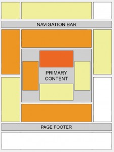
One import thing about putting ads is that you’ve obtained your current positioning by putting content and users first. While it’s great to use the above heat map from Google Ads, it’s also very import to note that they’ve specified to think about how your users use your site, and to also put your users first.

There is a diminishing marginal return on ads. More ads do not mean more money. In fact, it might negatively impact the revenue on other ads, so it’s very important to take the placement, saturation, user-base, and usage of your site into account before placing ads willy-nilly. The heat map is used more as a “guideline” more so than the end-all-say-all of ad placements.

Your site is valuable to advertisers because users go to it; the users find it valuable for it being what it is. If you change what your site ultimately is, your user-base might react negatively to it, and your site can no longer be as effectively monetized.

Modify as Little as Possible

modify as little as possible

Today’s post is going to be on my opinion on modifying existing systems. Unless you’re a one-man-coder-army, and if you are… kudos, but often times, you’ll find yourself working with other people’s code. When working with code that you’re not too sure of its functionality, you should tread extremely carefully. Make small changes, review the effect, and then proceed. I’ve seen a lot of projects go wrong when they change multiple elements of a system to get to a specific result, only to fail, and then absolutely have no idea what went wrong.

By making small incremental changes, you can change the direction of the project when you’re getting unexpected results, you’ll also know what went wrong, and you can also correct it quickly. That being said, you can probably feel more confident making these changes if you were in a TDD (test driven environment), since you can run a regression test on the existing system to make sure nothing is broken and everything is working the same. On the other-hand, a TDD environment introduces its overhead. Unless you have a TDD environment, it’s probably best to stick with the practice of making your changes small incremental bursts followed by a lot of review.